I built a tool that compares pizza places and training centers around one GPS point.
This is not a sentence that asks to be taken seriously.
That is why it worked.
Heat From Here began as a small absurd field tool: choose one point, fetch mapped pizza and training-center data, and turn the result into a visual field note.
The premise is deliberately unserious.
The method is not.
The tool does not tell you where to open a restaurant. It does not tell you where to live. It does not tell you whether a city is healthy, broken, optimized, underfed, overtrained, or spiritually close to a slice.
It generates a local visual field note from public map data.
That is all.
And that small boundary turned out to matter more than the joke.
The first rule was refusal
Most map tools are tempted by authority.
The moment dots appear on a map, the interface begins to sound smarter than it is. Add a heat surface and people start looking for conclusions. Add a ratio and the map begins pretending it has an opinion.
Pizza-heavy.
Training-heavy.
Balanced.
Low-data.
The words are useful because they make the image readable. But they are dangerous if they start behaving like advice.
So the first serious design rule of Heat From Here was refusal.
It is not a recommendation engine.
It is not a site-selection tool.
It is not an investment instrument.
It is not a claim of commercial viability.
It should not be used to make life decisions, open restaurants, avoid exercise, or explain urban civilization.
If you are lucky, it may help you stop being hungry.
That disclaimer is funny because the object is funny. But it also does real work. It keeps the tool from inflating itself.
It says: here is the field, here is the data we found, here is a visual transformation, here are the limits.
No more.
One point, one field
The tool starts with one chosen point.
That sounds simple, but it became the whole discipline of the project.
There is no account. No saved profile. No hidden scoring model. No dashboard backend. No database. No ranking system. No paid data layer.
The user chooses a point in the world and a rectangular field width.
The app then asks OpenStreetMap, through Overpass, what is mapped inside that field. It looks for pizza places, training centers, roads, and nearby place labels. It normalizes nodes, ways, and relations into points where needed. It keeps the evidence layer visible.
The raw marker map matters.
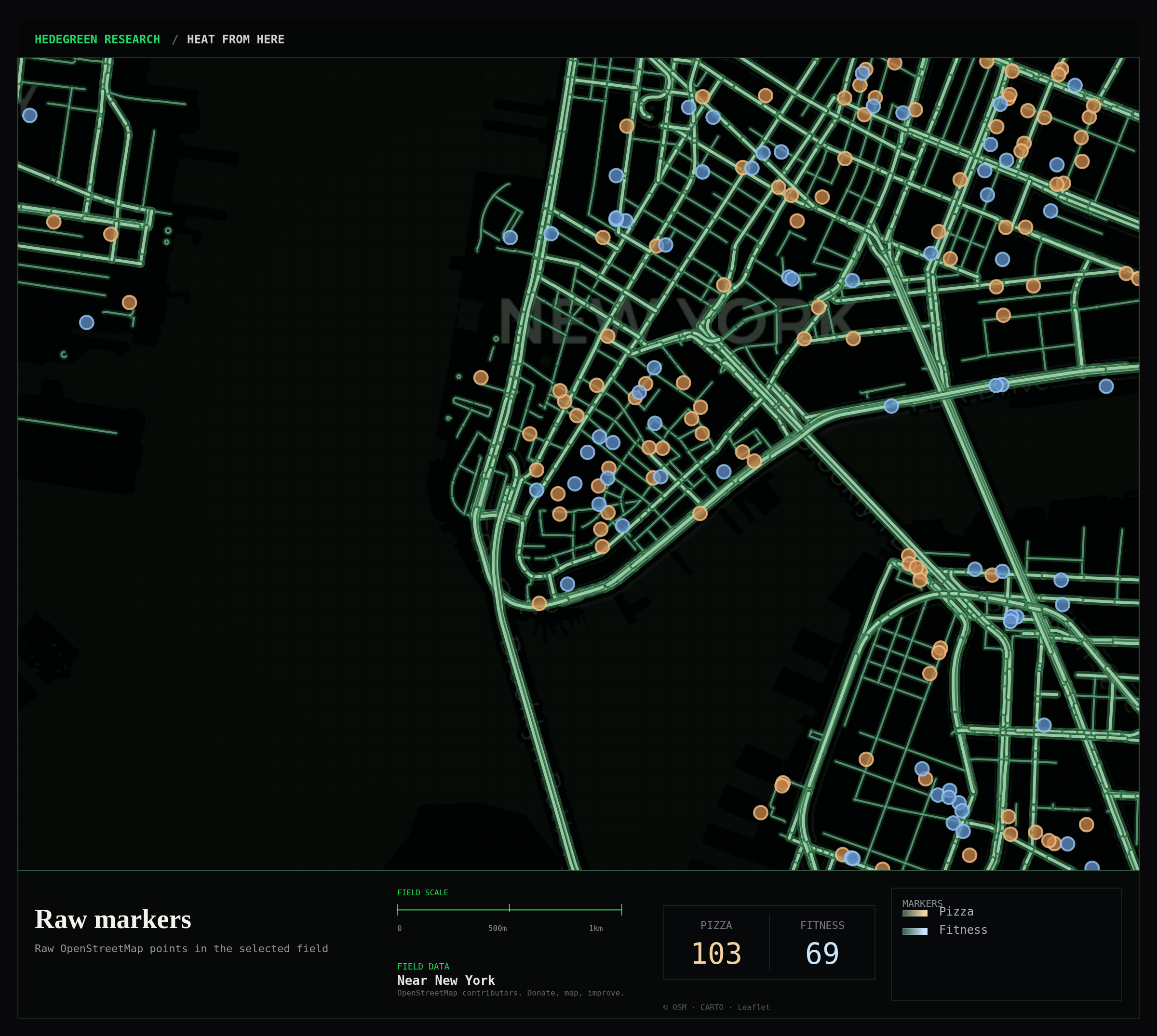
Without it, the heatmaps would feel too magical.
A density surface is a transformation. It can be beautiful. It can also hide what happened. So the tool keeps the boring layer: actual mapped pizza points, actual mapped training points, and the field that was searched.
That evidence map is not the prettiest output.
It is the map that keeps the rest honest.
The joke made the interface stricter
Because the subject was pizza and gyms, every false serious gesture became obvious.
If the tool had been about real estate, retail expansion, health access, investment, or public policy, it would have been easy to slip into dashboard language.
Opportunity zones.
Underserved markets.
Commercial imbalance.
Fitness deserts.
Location intelligence.
The pizza/gym premise made that language look ridiculous immediately.
Good.
The ridiculous premise forced the interface to become cleaner.
The maps had to show what they were doing. The labels had to be modest. The export cards had to carry counts, field scale, legend, place label, OpenStreetMap attribution, and Hedegreen Research identity without pretending to be a consultant deck.
The result is closer to a field note than a dashboard.
A dashboard usually wants to be used.
A field note wants to be inspected.
From marker map to surface
The early version showed markers and simple heat layers.
That was enough to prove the flow, but not enough to make the maps feel like generated artifacts. They still looked like normal web maps with colored dots.
So the tool moved toward canvas-rendered field surfaces.
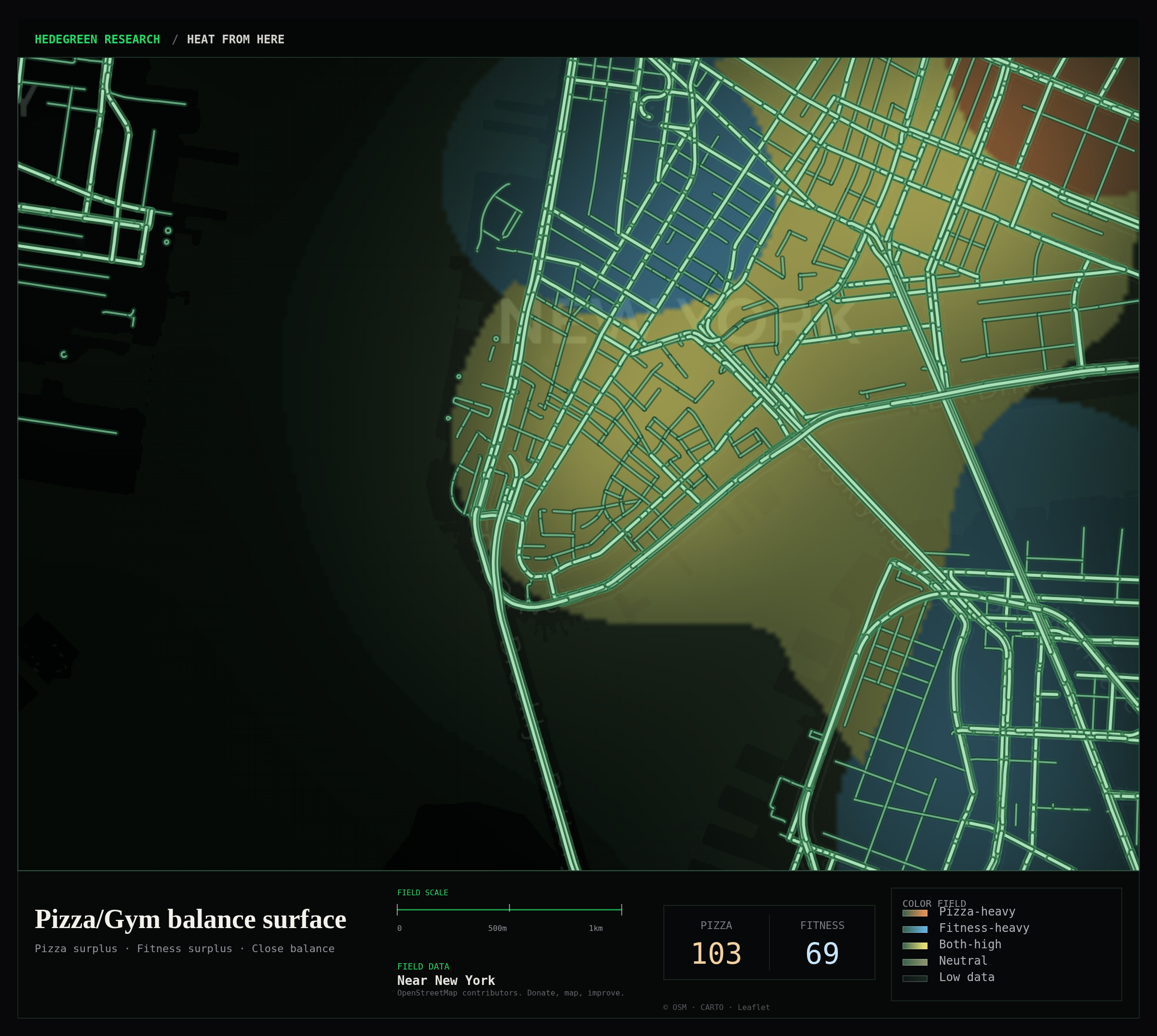
Pizza heat became a warm density field.
Training-center heat became a cooler density field.
Overlap showed where both signals were present.
Activity showed total local density.
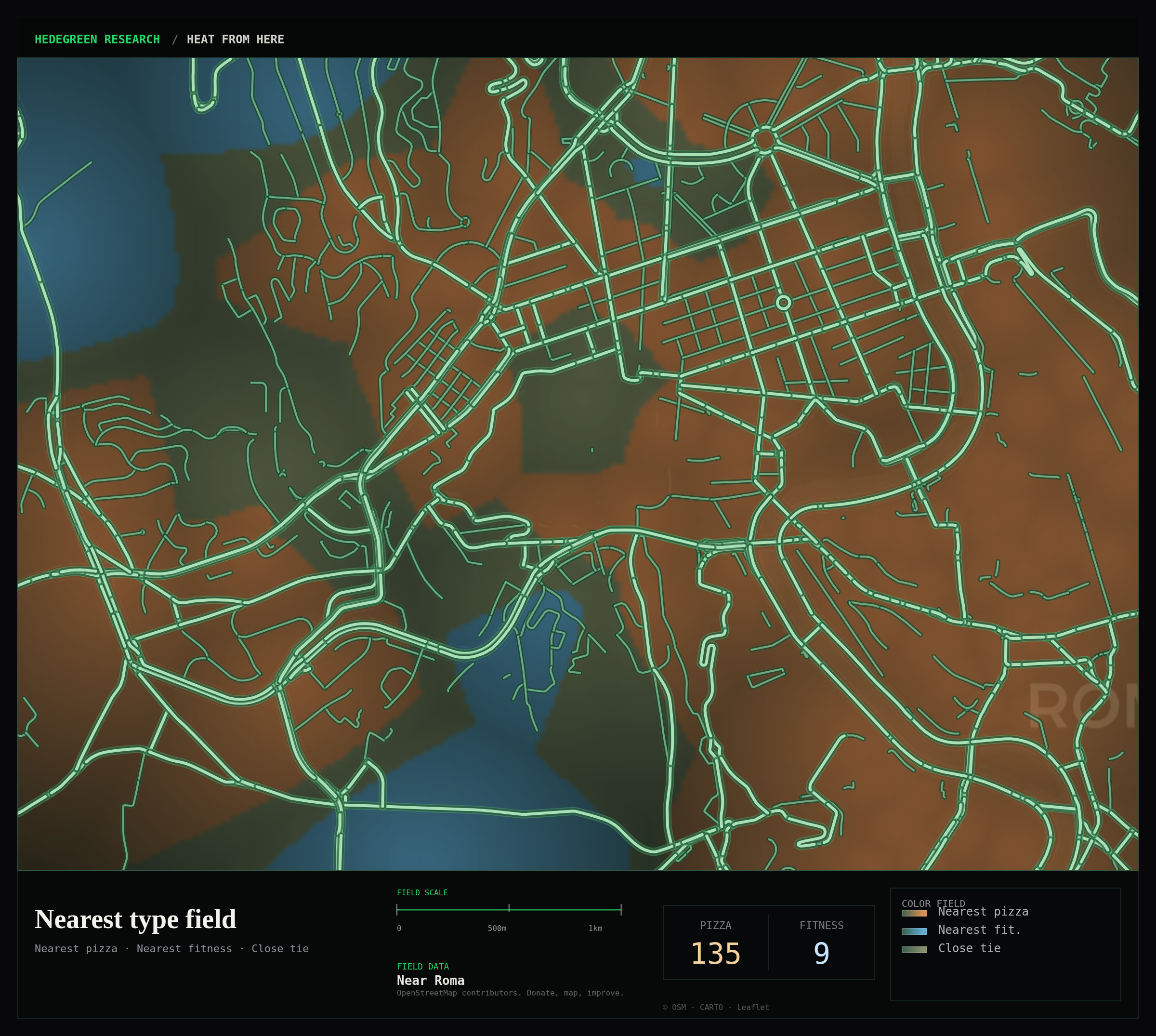
Nearest type split the field by which category was closer.
Imbalance and balance surfaces used combined density logic so the map could show pizza surplus, fitness surplus, close balance, both-high zones, and low-data areas.
That sounds more serious than it is.
The point was not to discover hidden truth in the city.
The point was to make the transformation visible enough that the viewer could understand the joke and the method at the same time.
If a field has one pizza place and no training centers, the tool should not scream "pizza dominance" as if it has discovered an urban law.
Low data should stay low.
Sparse data should look sparse.
Density should not become prophecy.
The export changed the project
The tool became more interesting when the output stopped being only an app screen.
The first working version generated maps in the browser. That was useful, but not enough for the format. The real object became the exported field card.
A good card had to survive outside the app.
It had to work on X. It had to fit in a feed. It had to carry its own context. It had to preserve attribution. It had to say what the colors meant. It had to show the field scale. It had to look like Hedegreen Research without looking like a pitch deck.
That forced another round of engineering.
The export renderer could not simply screenshot the browser. Browser chrome, scrollbars, hidden map containers, CORS behavior, and Leaflet timing all made that too fragile. The export had to be drawn as its own controlled canvas plate.
So the card became a composition:
map area, bottom metadata band, title, subtitle, field scale, pizza count, fitness count, legend, place label, OpenStreetMap support note, small legal attribution, and Hedegreen Research identity.
The app remained static.
The export became deliberate.
That is where the project stopped feeling like a toy and started feeling like a public format.
The public-data bargain
OpenStreetMap is part of the story because the tool depends on it.
But it depends on it in a way that should remain visible.
The data is not complete ground truth. It is mapped reality. It reflects local tagging, mapper attention, object duplication, missing names, different category habits, and all the ordinary unevenness of public geographic data.
The count is not reality. It is the result of one query against mapped public data.
That is not a flaw to hide.
It is part of the field note.
When the card says "Pizza 22" and "Fitness 26", it does not mean the world contains exactly 22 pizza places and 26 training centers in some metaphysical sense.
It means:
this query found this mapped data in this field at this time.
That is enough for the artifact.
The tool should thank OpenStreetMap not as a decorative attribution line, but as a reminder that public map infrastructure is maintained by people. Volunteer mapping, local correction, shared data, and public tooling are the reason a silly pizza/gym card can exist at all.
The joke sits on top of serious public infrastructure.
That should be visible.
Batch 001
The first test batch made the format feel real.
Vatican City.
CERN.
Apple Park.
Sydney Opera House.
Wall Street.
Shibuya Crossing.
Each place was chosen because it already carries a mythology. Religion, physics, design, culture, markets, crossing density. Then the tool applied the same deadpan question to each:
what does the local pizza/gym field look like?
The Vatican card worked because the tool did not need to explain the joke. A tiny sovereign state, a local field, and a pizza-dominant visual split were enough.
CERN worked differently. The language of fields, collisions, balance, and density was already sitting there waiting for the pizza layer to make it stupid.
Wall Street worked because the caption almost writes itself:
not financial advice.
Barely food advice.
The answer does not explain any of these places.
That is the point.
It gives each place a temporary second map.
Not a tourist map. Not an economic map. Not a health map. Not an optimization map.
A hunger-and-correction map.
That is a ridiculous category.
But the field note is real enough to inspect.
Why this belongs to Hedegreen Research
Heat From Here is not important because it maps pizza.
It is important because it tests a format.
A small public tool can be:
- static
- inspectable
- funny
- data-backed
- limited
- exportable
- visually coherent
- honest about what it is not
That combination matters.
The public internet is full of tools that pretend to be more than they are. Dashboards that imply certainty. Maps that imply authority. AI interfaces that produce smooth answers without showing the seams of the method. Analytics products that turn incomplete signals into confident recommendations.
Heat From Here goes the other way.
It starts with an absurd premise and then refuses to overclaim.
That makes it easier to trust.
Not because the tool is important.
Because it knows it is not.
The next layer
The obvious next step is more maps.
City atlas fields. Landmark plates. Better export packs. Optional PDF reports. Maybe larger fields. Maybe shareable URLs. Maybe more public-data categories.
But the more important next step is preserving the rule that made the tool work:
the method must remain clearer than the joke.
The joke gets people to look.
The method gives them something honest to see.
That is the useful part: one public question, one visible field, one limited dataset, one generated artifact, and a refusal to pretend that a map has solved the world.
Sometimes enough is the whole method.
Dennis Hedegreen